
Daisy design system
Company: HackerOne
Role: Product Designer (Contract)
2019

HackerOne helps organisations reduce the risk of a security incident by working with the world's largest community of hackers. In 2019 I joined the H1 design team to help creating their design system.
My role
My job was to design and creatively direct the creation and documentation of HackerOne's design system.
To begin, I audited all components, patterns and features currently in use.
When I first started, Daisy was a growing style guide with components, patterns, and features that included standard UI components such as navigation, data tables, buttons, search bars, and action confirmations.
- Developed and integrated a component-based design system into all aspects of design within the company
- Consolidating components and patterns across all platforms
- Implemented design system with the redesign of the website, which resulted in UX/UI consistency and the development of web guidelines
- Creation of new components with rules of usage
- Improved communication and productivity between design, development, and 3rd party agencies
- Ensuring 1-1 equivalence with react components from a visual & interaction standpoint
The process
I was immensely inspired by Air New Zealand's Unison, Atlassian'sI found myself greatly motivated by the design systems of Air New Zealand's Unison, Shopify's Polaris, Google's Material Design, and IBM's Carbon. To incorporate these ideas into my work, I began experimenting with three different internal products and worked to establish a consistent style and library of components and patterns. This involved discovering and stress-testing various design elements until I found what worked best.

Colours
To ensure that the colour palette met the WCAG contrast standards while maintaining HackerOne's brand identity, my initial approach was to use three colours that are central to HackerOne: Pink, Blue, and Green.
These colours would be used on elements that represent H1's identity to guide users and draw their attention. The primary colours were used to convey meaning, with Pink being used for primary actions as it is one of HackerOne's core brand colours.

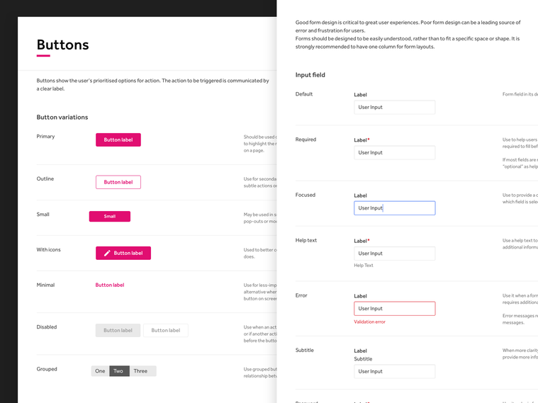
Buttons & Form fields
Designing forms with a clear and concise approach is crucial for creating remarkable user experiences. Poor form design can result in a myriad of issues, such as user errors, frustration, and a lack of confidence in the overall product.
It's essential to prioritise user experience when designing forms. They should be easily understood, regardless of their size or shape, and should be designed to guide users through the information-gathering process.
Attention to detail was key, and every aspect, such as field labels, input types, and validation messages, were carefully considered. By prioritising clear form design, we could create experiences that users would love and that will help them achieve their goals smoothly and efficiently.
Spacing and Breakpoints
A 8px grid system was set to be used when designing H1 products.
The 8px grid helps eliminate the guesswork, giving elements consistent visual hierarchy and provide better understanding.
Space scales are calculated using a geometric progression, which means each size is relative to the previous size, and is bigger by a fixed amount (known as the common ratio). This ensures that each size can be easily distinguished.

Takeaways
Creating an adaptive and responsive library of UI components enabled the H1 team to swiftly construct UIs and flows, avoiding the need for repetitive product redesigns.
The first iteration of the Daisy Design System comprised a comprehensive Sketch pattern library that included pliable components, colour and typography guidelines, and explicit instructions on adequately using each.
The design system was developed using Sketch and Storybook on the front end.